

Are you pondering whether to make a felted wool blanket? If you’ve been planning one for awhile, you may already have some sweaters collected. If you’ve just begun thinking about it recently, you may have gathered only a couple—or none at all.
Well, it’s nearly fall (for half the planet), which means sweaters are in resale shops around here and it’s a good time to go after them!

There are typically two things I think about when I look for sweaters. First, I consider fiber content and features. If you’d like to learn more about those, you can sign up here for my video, “Find and Choose Good Sweaters” (which will also add you to The Green Sheep email newsletter list).

Second, I need to think about combining colors. That’s what I’m going to talk about today.
Here’s the very, very best question to ask when combining colors:
When you put two sweaters next to each other, DO THEY SING? Do they ask to be playmates? Do you hate to separate them?
If you answer YES, then keep those babies together. They are
going to be beautiful in a blanket!
That is an excellent place to begin. But of course, pulling in even more sweaters and their colors can become a bit complicated.
I’m not going to call you crazy if you buy up all the wonderful sweaters you can find (umm, yes, I’ve done that, more than once). But that approach can leave you overwhelmed with possibilities. Another way would be to have a few ideas in mind as you start browsing.
But where do you get ideas?
For me, it’s often from photos, lot and lots of photos. When I first began making blankets, I feasted on photos in order to learn what I liked about various color combinations.
Way back at my start in The Green Sheep, I headed to the library for books of beautiful interiors. I made color photocopies of mesmerizing color combinations for my own reference. (Unfortunately, I can no longer find the titles of these wonderful books.) The blues and gray-greens in the right-hand photo with that golden wood harp—Wow! That one is still a favorite, and I’ve not thoroughly capitalized on it (although there are echos of it in “Quiet at Last,” below).


I’ve long loved Arts & Crafts-era objects, design and colors, so I browsed those books as well, and even subscribed to a magazine for a couple of years. William Morris’ Bird upholstery on the ebony chair, below, inspired “The 70s Throw” in the pic just underneath it.


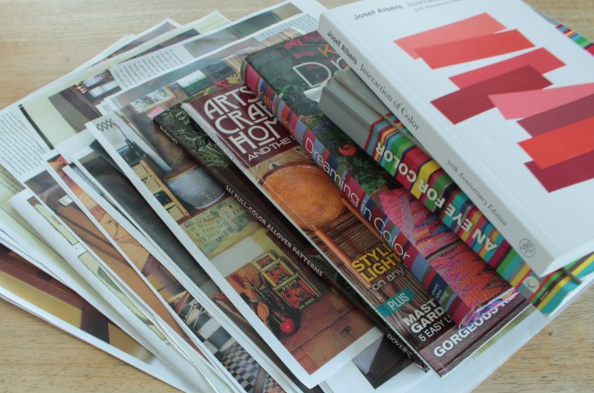
This little book, An Eye for Color, has sparked ideas for many projects. (I’ve actually mentioned it several times, initially here. It has played a part in several blankets, including “A Sunbeam to Warm You” and “Summer Nostalgia.”
Author Olga Gutierrez de la Roza organizes this book by color, populating it with photos of a wide variety of art pieces. She then pulls out several of the colors present in each and prints an accompanying “palette.”


The colors in this painting of the woman are deeper but similar to the colors in a fave photo I already showed you above. I’ll repeat it here (the one on the left). Right?? Over time I began to see patterns in what I’m drawn to.
This photo idea thing can work two directions: Method 1 starts with the PHOTOS and Method 2 starts with the SWEATERS. In Method 1, I use photos to help me dream up a complementary set of colors, and then I look for sweaters to be part of that plan. In Method 2, I look at what sweaters I have on hand, and then use photos to get an idea of interesting combinations.
In a riff on Method 2, I also refer to photos to help me solve questions of how to mix several color hues and values in one blanket. (This is especially true when a client ships me a box of many sweaters, all destined for one custom-ordered blanket.) For the blanket that became “Happy Winter,” I started with sweaters in complementary color families—blues, purples, pinks, reds—but the mix of brights and pastels felt very choppy together. This pic below from Gutierrez’ book helped me understand how I needed to establish order and pattern to bring together the high-contrast colors smoothly. You can find the final “Happy Winter” below.


Happy Winter
A book of Hans Christian Andersen tales, illustrated by Lisbeth Zwerger, helped me recapture a childlike freedom to play with the many, many pastel-colored sweaters that arrived in a client’s box to be put into a little girls’ bedspread. Those sweaters eventually became “Calliope’s Castle,” below.


Josef Albers’ Interaction of Color helped me understand the power of placing particular colors next to each other. I realized after-the-fact how influential the book had been, even years after working through it, when I stood back after finishing “Blessed are the Merciful,” below.


©Joan Olson “Blessed are the Merciful” (61×75) Felted wool sweaters
There you have it. There are infinite resources out there, right? I encourage you to find what color combinations you like. Start anywhere! Capture and save online photos, search your bookshelves for beauty, sit in front of your favorite “picture book” section of the library and choose some print materials—magazines? art books? interior design books? And always, always hold your sweaters next to each other and see which ones are begging to be partners. Have fun!